A Passion for Providing Quality in Printing
Today our journey takes a dramatic ascent into some nerdy digital imaging specs where we’ll be picking our way through terms such as screen calibration, colour correction, ICC profiles and colour gamut. For those of us squinting in confusion at these odd words on the screen, they simply refer to processes of colour management.


Today our journey takes a dramatic ascent into some nerdy digital imaging specs where we’ll be picking our way through terms such as screen calibration, colour correction, ICC profiles and colour gamut. For those of us squinting in confusion at these odd words on the screen, they simply refer to processes of colour management.
Great question! Glad you asked Before discussing the how, lets define the why – in other words, the goal of colour management, which is to match colours across display or print views regardless of the brand or type of camera, computer monitor, scanner or printed materials of the same image.
Colour Management
Colour management is a quality-control process to ensure the fidelity, consistency and predictability of digital colour. So; what’s involved in colour management and how do you go about choosing the correct colour values?
Friends, the straight-up answer is, this is based on in-depth knowledge and experience and because colour preferences are quite subjective, it can be a very involved consultative exercise between a professional Printing Technician and the artist. So yes, if you want to leave it in the hands of the experts to undertake the extensive colour correction and record-keeping it takes to guarantee a colour match on reproduction prints then you may want to skip this part.
However, if you do want to know the basics so you can geek out with your Printing Technician or even ensure you’ve got the best possible set up of your own equipment to understand the fine art printing process and produce a more efficient end product, read on:
Several elements make up colour management, starting with colour profiles, which define the colours captured on a camera and viewable on screen displays. Colour profiles control the colours that are available to be used (see colour gamut below) and help provide consistency between devices.
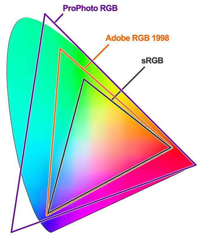
Colour gamut
Colour gamut refers to the spectrum of colours that an electronic display can accurately reproduce on-screen and is at the mercy of the optical properties of a device’s display architecture. To break it down: the larger or wider the gamut, the richer and more saturated the colours available
Fun fact: the term “the full gamut” has entered western lexicon to describe the whole range of a particular thing, but it originated from the medieval Latin term gamma ut; the name of the lowest musical note in the medieval scale

Screen Calibration
The vast majority of computer screens are not calibrated (which there is a whole science behind) but basically, screens project light and are designed to be vibrant, so what you see on your screen is rarely what the print will look like.
Enter ICC: developed by Apple; a vendor-neutral, cross-platform colour management system, enabling standardised colour space mapping between the source and target outputs. In other words, universal calibration; or the process of altering the colour response across devices to wrangle accurate corrections to improve the gamma, white point and colour accuracy of your screen for consistently accurate colour reproduction to your desired surface.
Now at version 4 (v4), ICC is a basic -but essential- way of accurately setting your displays colours without requiring specialised hardware and a Windows version is available, called ICM (Image Colour Management).
You can download ICC/ ICM files for different displays from either the manufacturer’s website for your specific display model or web search your device model + “colour profile” and implant that to your colour settings via “ColorSync Utility” – Mac or “Color Management” – Windows.
Stay tuned for part three of The Artists’ Definitive Guide to Printing where we’ll discover that not all inks are made equal, and the ways that RGB printers are a game-changer for giclee and fine art printing!
