A Passion for Providing Quality in Printing
Now that we can confidently manage colour across devices with a combination of screen calibration software and hardware (or at least, know enough not to look like a complete noob when talking to our trusty Printing expert) there are two other important elements to this fine art reproduction matrix. Let us now set our sights on the lofty landscape of inks and papers.


Dear Artists,
So far in our Artists’ Definitive Guide to Printing series, we’ve taken you on an information trek, Sherpa-style into the deep valleys and high passes of communicating with your printer, image capture for a perfectly rendered digital artwork and the wide gamut of colour management to get your image print-ready.
Now that we can confidently manage colour across devices with a combination of screen calibration software and hardware (or at least, know enough not to look like a complete noob when talking to our trusty Printing expert) there are two other important elements to this fine art reproduction matrix. Let us now set our sights on the lofty landscape of inks and papers.
(see what we did there ok nevermind
Here we will talk about considerations you need to make when preparing your artwork for print: types of inks and printing processes, the additive RGB colour spaces that the eye detects vs the subtractive CMYK industry standards that we are limited to with printing inks, and the pitfalls of converting the two colour profiles.
So, what’s the difference between laser and inkjet printers and does it matter in archival quality printing?
Inkjet printers use liquid ink and are divided up into either dye-based or pigment-based inks, both of which produce high quality prints, thanks to liquid inks, rather than powder. Consumer standard dye-based inks produce super sharp text and rich, vibrant colours in your images, but they aren’t waterproof and the colours will fade relatively fast (5-25 years).
So that leaves us with pigment-based inks.
Designed for long lasting photo-quality colour, pigment ink sets are available in a wider range of tones than the standard dye-based inks and are specialised for use with different kinds of paper. With considerably stronger archival qualities (100 years +), using pigment-based rather than dye-based inks is a non-negotiable for the serious fine artist considering digital reproduction.
So let’s back up for a minute for a quick recap and deeper descent into our previous (part 2) blog surrounding colour spaces and how it ties in with printing.
If you’ve been around digital design for print long enough, you’ll know the uniquely provoking displeasure of creating a gorgeous image with just the right blend of bold and bright tones, only to be faced with having to convert your RBG files to the weird, muddy four-colour space of CMYK for printing.
Trying to colour correct to bring those bright tones up again after conversion leaves most designers ready to hurl their bulletproof coffee at their screen in frustration.
This perennial issue of needing to convert your artwork from the additive colour space of RGB (light-emitting tones) to the subtractive profile of CMYK inks has been approached a myriad of ways with all kinds of workarounds used to combat it:
Fun things like custom-saving each of your colour profiles into Adobe Bridge, speaking calming mantras over yourself while cross-referencing Pantone spot colour cards, muttering RGB numbers under your breath whilst converting to hexadecimals or juggling 15 open browser tabs and four Adobe programs in a valiant effort to get your head around software conversion algorithms.
But geez, wouldn’t it be nice if there was an easy option to sidestep the CMYK colour profile conversion issues to get those lovelyjuvley RGB colours into print?
The obvious answer would be to just work with a greater number of colour inks and dilutions of black inks to more closely match what you’re seeing on your screen.
While most professional printing services out there still use traditional four-colour CMYK printing inks, but what you may not know is that it’s now possible to triple your colour gamut capabilities with RGB printing.
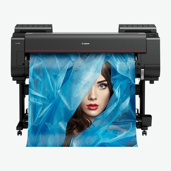
Thanks to Creffields’ state-of-the-art Inkjet Canon Prograf professional printer, a full span of 12 pigment-based colourants: red, green, blue, photo grey, grey, black, light cyan, cyan, matt black, yellow, magenta and light magenta blow your gamut expansion wide open when printing from a 16-bit tiff or psd file in the ProPhoto RGB (or at least Adobe RGB) colour space.
Vivid colour and tone, super smooth gradations and unbelievable shadow detail make this is a game-changer for the fine art printer, digital artist and pro photographer wanting archive-quality giclée prints that will showcase their art in the best possible manner AND last the distance.
We’ve covered printers and inks and our path now takes us to the type of material to be printed on. A paper trail, if you will.
Paper choice in fine art printing is both an artistic and technical one. A good paper will complement the image, take the image up some notches in artistic expression and will improve its value to the collector.
And here, we come to a crossroad. Do we print on paper? If so what kind of paper? Or do you want to print on canvas? Is the quality any good? What about other types of surfaces like metal, wood or banners?
First, paper. If you’re an artist or photographer looking to display or sell your work, giclée (pronounced shjee-clay) printing is the golden egg. A fine art digital printing process combining high-quality fade-resistant pigment-based inks on either a special acid neutral archival/ museum quality photo paper that makes images last longer while maintaining their colour to achieve an inkjet print of superior archival quality, light fastness and stability.
There are three basic types of high quality inkjet papers.
RC photo papers ‘resin coated’ papers are alpha cellulose-based papers encased in plastic polyethene, allowing for a glossy, satin, lustre, metallic or pearl surfaces and are fairly scuff resistant. Great quality but not archival stock.
Alpha-cellulose papers are fine art papers made from high grade tree wood pulp refined to remove acid and lignin. Fibre-based baryta photo papers such as cotton or alpha-cellulose achieve incredibly rich blacks, wide gamuts, great contrast, sharpness and smooth tonal transitions with fine archival properties.
Cotton Rag Papers are a gorgeous, higher grade paper with hectic strength and durability. Made from cotton linters or cotton rags (or a combination of both) and a velvety smooth texture reminiscent of an etching surface that emulates the appearance of original fine art.
Most of these papers have many options for the type of ‘finish’ they have including glossy, lustre/ pearl, paper whiteness or even metallic.
Each fine art inkjet paper comes with its own product data sheet that describes its composition, GSM (grams per square metre), printer/ ink compatibility, best applications and storage recommendations for optimum outpu
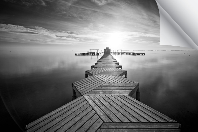
Sihl Masterclass offers outstanding image quality and stability guarantee prints with optimal ink densities and an outstanding finishing property.
Their three product groups include glossy featuring the highest resolution and an iridescent shimmer, lustre which is suitable for presentation in difficult or interior lighting conditions and it fingerprint resistant coating makes it ideal for manual handling. The black & white baryta paper boast a smooth, satin finish and a subtle warm colouring combined with perfect definition and subtle greyscale gradation.
Moab Slickrock is an astonishing metallic pearl gloss paper that produces lifelike quality perfect for fine artists and photographers wanting to producing deep blacks and ultra-bright highlights whilst enhancing their images with a metallic characteristic that jumps out of the page.
Canvas printing ain’t what it used to be: you can replicate or reproduce artwork on canvas or print an image and paint over the top to create an entirely new piece. But for the fine art printer and discerning photographer, printing digital reproductions of artworks onto canvas can be synonymous with excellence.
At Creffield, we use the the highest quality cotton canvas, coupled with our 12-colour ink giclée printing, followed by two applications of liquid laminate and finally, the canvas is expertly stretched and finished with framers’ tape and hanging wire.
You’re an artist. You like to test the limits and push the boundaries. Status quo is an insult. So, what’s your crazy, wonderful and one-of-a-kind idea that the world is waiting for?
With direct printing, any surface is game and all you need is to collaborate with a Print Technician that loves crazy as much as you. Designed to encourage imagination, not stifle it, direct printing challenges you to think outside the box – or even print on it!
Once you’ve settled on the technical and artistic merits you need in your giclée print and done a roundup of the type and range of fine art papers that meet your expectations, you’ll want to test em out. Here is where you really get to collab with your Printer to pull together all the previous elements we’ve discussed in this blog series so far and print a series of test strips with your custom created colour profiles. Be prepared though, if you’re working with a Printing Technician who knows what they’re on about, this process will take about a dozen hours for each profile, using equipment worth tens of thousands of dollars.
If you need clarification on what colour spaces, inks or papers to use for your specific artwork, simply reach out to one of our expert printing technicians who will be super happy to advise you on the best processes for your unique piece!
